By David Ponce
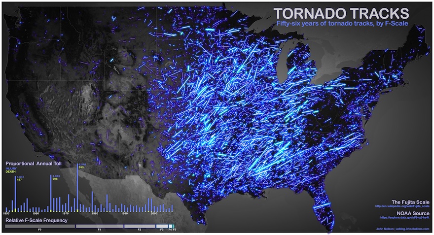
The fun thing about data is that it can be displayed in a ton of different ways, and sometimes the results are very pretty. Seen above (click it to enlarge) is a map of the United States showing every tornado on record since 1950 going up to 2006. One John Nelson pulled all the relevant data from the Data.gov website (representing almost 60 years of NOAA information), and color-coded F0 storms a dark purple, while neon blue was used to represent the most powerful category — F5 storms. The result is the above and if anything, it makes us wonder why anyone in their right mind would live in the Eastern part of the country.
[ John Nelson ] VIA [ Geekosystem ] AND [ Full Size Resolution Here ]


