So this is where you guys get to chime in. I should start by telling you that a major site redesign is in the works. Cutesy wootsy as this site is, it’s time for a facelift and we’ve been working on just that. Please don’t cry, it’s not you, it’s me and it’s time to move on, what with our 8 month anniversary fast approaching.
I’m not saying that that’s when the new site will be launched, there’s still no date, but as soon as I have one, I’ll let y’all know. I just wanted to take this space for two things: whip up a little excitement and two… let you all participate in the process. We’re looking at not only a new look, but also new features and we’re wondering… what would you guys like to see?
So go ahead, comment like mad. Throw anything in there: crazy, stupid or brilliant, we’ll sort the wacko from the bravo and get inspired. Many of you have been reading this site for a while, so now’s your chance of doing a little bit more than read.
Talk to us, even if it’s the last thing you ever do.


I think the new Amazon GUI is great, simple but when you mouse over a category you can see more links. The site also has nice fluid graphics, you will even notice that ebay and msn are moving to similar desgins.
Less Nauseating Eye Jewelry, please.
Scratch that. *No* nauseating eye jewelry, please
1. Ditch the logo (even though I’m a real Palm freak, it looks so dated…)
2. Try not to look like every other tech blog out there with a few inches of text on the left interrupted by a bunch of ads; come up with something really unique…and cool looking. Maybe come up with the text about four inches from the left with the links near the top and the ads draping down from there…
3. More frequent posting would be nice. There is a washable keyboard out there and I didn’t see anything on this site about it before it came out (maybe I missed a day?).
4. Do something FUN which is what gizmos are for…
that’s all i can thunk about
How about you format the site for 1024*768? I bought a 19″ monitor and have to read everything in a 3″ wide column with a bunch of blank space on the right.
there is a time & place for crustless bread & cone shaped pizza, but certainly not on a tech blog.
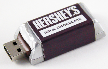
I’d like more on where to get cool-looking USB drives and computers, and more gizmos for the home.
I like your write ups that go with stories, please keep that up. Your site already loads pretty fast, hope the next version retains this.
stick to the gadgets and tech stuff rather than the other crap you feature
Sorry for the late input, but I’d like to see something less generic looking… Jazz things up a bit perhaps by having a homepage of pictures of the gadgets and gizmos then click on it to see the article about it? With all the white around here and PDA in the logo you have a blank canvas basically.